
Illinois.gov
Redesigning a state's website to make
its resources more accessible

• Heuristical Analysis • Open Card Sort • Problem Statements • Proposed Sitemap
• Low & Hi-Fi Wireframes • Prototype • Original copy tailored to users
• Imagery & color scheme
PROJECT CONTEXT
Illinois.gov: Digital Disgrace
Criticizing government websites has become a popular sport. As a proud Illinoisan by birth, I was dismayed to learn that http://www.illinois.gov makes numerous lists for 'worst government websites.' I thought I'd take a closer look to investigate how it's failing IL residents.
THE PROBLEM
Lack of Accessibility
A glance at online reviews made me realize that the problems are more than cosmetic. Visitors complain that they feel overwhelmed by the site. Often, they don't know where to start looking for the resources they need. Half of respondents in an online study disagreed with the statement that the site is accessible.
THE GOAL
Pinpoint Barriers to Accessibility
After identifying the problem, I set out to understand why visitors have so much trouble finding what they're looking for, and what design and/or copy changes would improve the site's accessibility.
THE RESEARCH
Methods
To answer these questions, I chose research tools that would help me diagnose the website. I didn't try to understand 'the user' because the site serves a diverse population.
-
Online Forum Reviews
-
Heuristic Evaluation
-
Open Card Sort Exercise
1. Online Forum Reviews
A review of some user sites helped me understand the kinds of frustrations visitors have. The complaints tend to address the volume of information on the site and the lack of a clear direction to anything specific.
"There's so much information that you have to drill many layers to get specific information."
Illinois.gov user 1
"It could get confusing searching for certain items."
Illinois.gov user 2
"I wasn't sure where to go at first."
Illinois.gov user 3
2. Heuristic Evaluation
I performed a Heuristic Analysis* to assess how accessible and user-friendly the website is.
It helped me pinpoint problems with headers, the content stored and displayed on pages, and overall copy.
The Navigation System offers poor direction:
The headers are too vague to direct to specific resources.
They include, "Government," "Business," "Employment," "Education," "Residents," and "Education."
The headers link to gluts of information.
They link to pages with lots of conflated services ("data dumps").
Copy is too generic and vague to explain the resources.
Service headings are comically vague.
They include 'Find Road Services' -find them where??, 'Locate Registered Sex Offenders' -who needs a sex offender? ?
CTA's offer little direction.
CTA's like "GO TO SERVICE" and "VIEW LIVE VIDEO" don't identify what action the user is about to take. What service? What sort of video?
Names of agencies are esoteric.
Drivers seeking to renew a license (a common task) must click on "Offices of the Secretary of State." Do they know this is the DMV?
Also, the visuals and copy are unengaging.
This isn't confusing, but it loses visitors' attention.
The tagline is uninformative and trite.
"Find places to go, things to see. Search through all the different services offered by the various Illinois agencies" is wordy and says nothing.
The images are generic.
Note the imagery on the homepage!
*I relied roughly on the 10 metrics or 'heuristics' laid out by the Nielsen Group to derive my insights. See https://www.nngroup.com/articles/ten-usability-heuristics/
3. Open Card Sort Exercise
I understood that words like "Employment" and "Government" are too vague to direct users to specific resources. I performed an Open Card Sort* to learn how users might categorize government services:
One pattern emerged: users want to find resources for them and be directed to specific services.


This Card Sort shows a typical clustering. The exercise asked volunteers to cluster the words above and make up topic headers.
THE DESIGN PROCESS
Ideation
Once I had a better understanding of what might be intuitive to visitors, I thought about how to reorganize and display the content.
-
Problem statements
-
Sitemap (before and after)
-
Low-fi wireframes
-
Hi-fi wireframes
-
Government services (before and after)
1. Problem statements (PS's)
I first took a minute to summarize the challenges IL residents face when visiting the site.
Problem statement #1
Visitors need to discover resources* easily because they need them but may not know they're available.
*Govt. resources include disability benefits, financial aid, job assistance, etc.
Problem statement #2
Visitors need to discover resources quickly because they need them but don’t have time to browse the site.
Problem statement #3
Visitors need engaging headlines and images to direct them to useful articles because they'll otherwise overlook them.
2. Sitemap: Before and After
A glance at the old Sitemap shows how generic and broad the headers are, and how sprawling the content.
Illinois.gov's Sitemap
Government
-
Business registration
-
IL business info Corp & LLC’s name search
-
Verify a registered business
-
Become a vendor
-
Certificate of resale Corp & LLC online filings
-
Locate a registered business name
Business
-
Prof. License Lookup
-
Employee salary database
-
IL Pin
-
Find public records
-
Email the goveror
-
Vehicle title & registration
status inquiry -
Estimated Payments
Employment
-
Employment charge of discrimination
-
Pesticide license search
-
Taxpayer answer center
-
Income tax & refund status inquiry
-
Error notice & bill inquiry
-
File income taxes
-
IL income tax filing
-
Tax rate finder
Education
-
Find info on the IL science assessemnt
-
Find info on the every student succeeds act
-
College access & financial aid: workshops & one on one assistance
-
Financial aid: grants & scholarships
-
College IL: 529 prepaid tuition app
Residents
-
Business registration
Watercraft & snowmobile renewal
-
Child support account serv
-
View child support payments
-
Address change for motorists
-
Apply for vehicle title & registration
-
Circuit breaker license plate
Visiting
-
Find competitions entry & results info at the IL state fair
-
Find concerts & entertainment at the IL State Fair
-
Purchase tickets to the IL State Fair
-
Purchase tickets to the DuQuoin State Fair
IL rest areas -
Find current winter road
The sprawl is faded out for brevity's sake.
My headers target visitors by demographic. A multi-tiered hierarchy directs them to specific services.
My Sitemap
RESIDENTS*
For Families
For Professionals
For People with Disabilities
For Employees
For Job Seekers
For the General Public
-
Our School System
-
Plan Ahead for College
-
College Illinois! Prepaid Tuition Plan
-
Plans
-
ISAC plans
-
ASBE grants
-
-
- For Families in Need
-
Learn about our financial resources
-
The MAP for tuition assist
-
Dept. of Healthcare & Family Serv. (DHFS)
-
-
Obtain or Update a License
-
Update an Address
-
Become a Service Provider
-
Become a Lender
-
For Business Owners
-
Register a business
-
Look up a business
-
Recruit & hire
-
-
Learn About Our Rehab Serv
-
The DHR
-
Our Job Coaching & Day Serv program
-
-
Apply for Workers’ Comp
-
Get Health Ins. for College Tuition (state employees)
-
Get Fair Compensation
-
The Equal Pay Act
-
Fed & state min wage
-
Your pay stubs
-
-
File a Complaint
-
Access our Job Listings
-
Govt jobs
-
Private sector jobs
-
-
Access Our Career Serv.
-
Resume building
-
Interview preparation
-
Job fairs
-
Career assessment
-
-
Access Unemployment Resources
-
File or certify for benefits
-
Layoff Assist Guide
-
-
File Your Taxes
-
Tax amount & status of refund
-
Tax filing assist
-
-
Access DMV Serv.
-
Obtain or renew vehicle title registration
-
Obtain or renew a license
-
-
Give Back to the Community
-
Join the Nat. Guard
-
Serve on an IL Board
-
Volunteer
-
ALPLM
-
The Gov Mansion
-
The IDNR
-
The IDCFS
-
The IDOC
-
The Ombudsman Program
-
-
Donate
-
Cons Found.
-
-
3. Low-fi wireframes
I drafted low-fi wireframes to show how this hierarchy might look on a site. I thought about images, hyperlinks, and what pages should store what content.
Clicking on 'Residents' takes the user to the Residents page
Homepage
Residents page


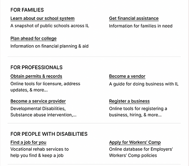

Clicking on the heading 'FOR JOB SEEKERS' takes the user to the Job Seekers page
Job Seekers page


4. Hi-fi wireframes
Color and imagery breath life into the wireframes. It becomes even easier to find and click on services.
Clicking on 'Residents' takes the user to the Residents page
Homepage
Residents page


Clicking on the heading 'FOR JOB SEEKERS' takes the user to the Job Seekers page

Job Seekers page


5. Govt. Services: Before and After
I revised the copy, imagery, and layout for specific cards on Illinois' website.
1. Road conditions tracker:
Illinois.gov's version:

Visitors will get a sense of what this post links to, but it's unclear what the resource is or what regions it covers.
My version:

This relays more info about traffic and road conditions throughout the state. It clarifies that it can help users plan a route.
2. Professional license verification:
Illinois.gov's version:

This is a little confusing... whose license can be looked up, and for what purpose?
My version:

A simple word like 'verify' explains what this resource is, who it's for, and why it's useful.
3. Protect yourself from local predators:
Illinois.gov's version:

Visitors will likely understand that this is a safety tool, but it's not clear for whom. It could be for law enforcement or an employer who wants to run a background check.
My version:
The title and imagery make it clear this is a resource for residents. It also makes clear that the database includes all criminal offenders.

4. Employment resources:
Illinois.gov's version:

Aside from being generic, this post only advertises govt. jobs. The site also links to a private sector job database and career resources. Why not inform visitors?
My version:

This job portal is more eye-catching and it better communicates available resources for job seekers.
5. A news post with tips on taking financial precautions:
Illinois.gov's version:

A passive voice that talks about crime is easy to overlook. It reads like a prelude. Visitors likely won't know what IDOR is.
My version:

The title at a glance tells visitors what the article is about. The active voice gives them concrete ideas for protecting their finances.
6. Homepage:
Illinois.gov's version:

The tagline is long, rambling, and vague. It sounds like a Dr. Seuss quote ("Oh, the places you'll go! The people you'll see!")
My version:

Describe your image

Describe your image

Describe your image
Describe your image
A tagline isn't really necessary when the headers direct visitors effectively to recourses. Instead, more interesting imagery and fun facts are displayed. A 'Welcome to Illinois' slogan might be helpful if the Illinois label at the top left is insufficient.
THE TESTING PROCESS
Methods
It would be difficult to do a meaningful usability test with this sample to see how improved it is because it only shows a fraction of what the actual website shows. So, the prototype will be easier to scan.
Final Prototype:
Play the prototype to see the designs brought to life!
